Simplifying fund transfer experience between a customer's accounts.
Westpac
Designing an intuitive and efficient fund transfer experience for users within their own accounts is a critical feature of any banking application.
Westpac, a major Australian bank, set out to redesign the fund transfer experience within their mobile banking app. The goal was to streamline the process of transferring funds between a customer's own accounts, ensuring the experience was efficient, intuitive, and secure.
The UX design focused on reducing cognitive load by using familiar icons and terminology. For example, drop-down menus for selecting from and to accounts, a numeric keypad for entering amounts, and clear call-to-action buttons.
Understanding user needs to transfer between own accounts
The design process began with a thorough analysis of user needs and behaviors. Surveys, interviews, and usability testing were conducted to understand how users interacted with the fund transfer feature. It was identified that users desired a seamless, quick, and secure way to transfer funds between their accounts without having to navigate through multiple screens.
Customer problem
Customers expressed frustration with the existing multi-step process, which was time-consuming and cumbersome. The challenge was to reduce the complexity and number of steps involved in the fund transfer process, thereby addressing customer complaints about the app being too difficult and slow to navigate.
User research
To understand the specific pain points, the Westpac team conducted extensive user research. This included interviews, surveys, and observational studies of how customers used the app. The research highlighted the need for a simplified process, the desire for instant confirmation of transactions, and a clear understanding of transfer limits and processing times.
Defining the user journey
The user journey was mapped out to ensure that the process of transferring funds was intuitive. This journey started with the user logging into the app and ended with them receiving a confirmation that their transfer was successful. Important steps like account selection, entering the amount, and reviewing the transfer before confirmation were all streamlined to minimize the number of user actions required.
Applying GEL principles
Utilizing the principles of GEL, which emphasize clear visual language, reusable components, and accessibility, the design team started sketching out the user interface. GEL's comprehensive style guide provided a robust set of design patterns and components such as form fields, buttons, and confirmation dialogs, which were used to create a consistent look and feel.
Designing the flow
The user flow was meticulously planned to minimize the number of steps required to complete a transfer. The design allowed users to select both the 'from' and 'to' accounts on a single screen. This screen utilized GEL's typography and color schemes to differentiate between accounts easily and provide a clear hierarchy of information.
Interactive elements
Interactive elements such as dropdowns and sliders for selecting accounts and inputting the amount were designed with GEL's responsive principles in mind, ensuring that the experience was optimized for both mobile and tablet devices. The components were also designed to be finger-friendly, with ample touch targets as per GEL's guidelines.
Validation and feedback
Real-time validation was incorporated to provide immediate feedback if there were any errors, such as insufficient funds. Success and error messages were designed using GEL's iconography and messaging framework, ensuring that the feedback was easily understandable and visually integrated into the overall experience.
Security and trust
To instill trust and security, which are paramount in any banking experience, the design included a summary page before the final confirmation. This page outlined the details of the transfer, including the accounts involved and the amount. GEL's card design pattern was used to display this summary, which helped in isolating this information and making it stand out for final review.
Testing and iteration
Once the initial design was implemented, several rounds of user testing were conducted. The feedback was used to iterate on the design. For instance, users found the initial slider for selecting the amount to be imprecise for large sums, so it was replaced with a numeric keypad, which still adhered to GEL's input component guidelines.
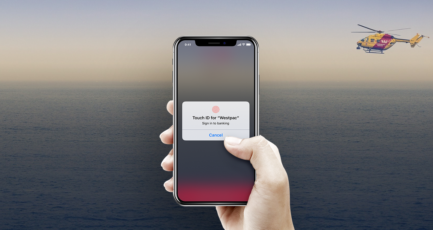
Security measures
Security is a top priority for banking apps. To ensure secure transfers, multi-factor authentication was implemented, requiring users to confirm their identity with a fingerprint or a one-time password (OTP) before a transfer could be completed. Additionally, the app was designed to timeout automatically after a period of inactivity.
Compliance and testing
Throughout the design and development process, compliance with financial regulations was paramount. The app included mandatory legal disclosures and the ability to view detailed transfer limits and regulations. Rigorous testing phases, including user testing and quality assurance, were conducted to ensure that the app met all necessary standards and was free from bugs.
Results
The redesigned fund transfer experience was well-received by Westpac customers, with an increase in mobile app satisfaction ratings. The app saw higher engagement rates, and the secure yet straightforward transfer process increased user trust and confidence in mobile banking with Westpac.
In conclusion, the design of the fund transfer experience in the Westpac app was a careful balance of usability and security. The process demonstrated the importance of understanding user needs, designing intuitive user journeys, implementing strong security measures, and adhering to financial regulations. The successful implementation of this feature contributed to a better banking experience for Westpac’s customers.