Boost Mobile wanted to redesign its self-service app. The business decided to do this by using its sibling app, My Telstra, as a foundation. Boost also wanted to simplify its pre-paid plans through a new tech stack, for better value. For me, the goal of the project was to deliver a better app experience and remove user pain-points to reduce the need for support calls.
Before the redesign, the Boost Mobile app faced several critical usability and accessibility issues. The experience was not purpose-built for prepaid customers and failed to meet basic UX and accessibility standards. Through internal reviews and early audits, we identified the following key pain points:
Inaccessible colour palette: The app used low-contrast colours and non-compliant visual styles, making it difficult for many users to read and interact with content—particularly those with visual impairments.
No HCD experience foundation: The original app was built with a graphic design mindset rather than user-centred principles, lacking coherent navigation, structure, or task flow.
Outdated & inconsistent UI patterns: Design elements were a mix of legacy mobile and web patterns, resulting in a disjointed experience that didn’t align with current native app standards.
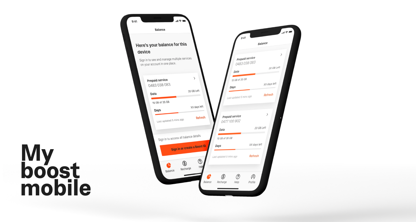
Lack of proper information architecture (IA): Key actions like recharging, usage tracking, and plan selection were buried or poorly organised, forcing users to hunt for basic functionality.
Feature-first, Not customer-first/needs: The app focused on listing services rather than solving real user needs—creating friction for cost-conscious prepaid customers looking for simplicity and control.
Accessibility not considered: There was no adherence to WCAG guidelines. Tap targets, readable fonts, and voice-over compatibility were not supported, excluding many users from using the app independently.
No user testing or feedback loops: The original build lacked validation through usability testing or customer feedback, meaning key decisions were made without real user insight.
Boost Mobile serves a diverse but distinct customer base, primarily made up of value-conscious, mobile-first users. These customers are often younger—students, digital natives, or those early in their financial journey, who favour prepaid plans for their flexibility, transparency, and low cost. Many are tech-savvy and prefer to manage their services independently through an app, expecting clear information, instant access, and simple recharge flows without unnecessary steps. Boost also appeals to customers in regional and rural areas seeking reliable coverage on the Telstra network at a more affordable price point.
For international visitors, temporary users, or those avoiding long-term commitments, the ease of prepaid offers a no-fuss alternative to traditional mobile plans. Across all segments, customers share common expectations: intuitive navigation, clear usage tracking, low data consumption, and an inclusive experience that works seamlessly across devices: regardless of ability, location, or bandwidth.
At the outset of the Boost Mobile app redesign, we set clear, measurable goals to guide our success. The primary goal of redesigning the Boost Mobile app was to better serve the real needs of prepaid customers: users who value simplicity, control, and affordability. The existing experience was cluttered, inaccessible, and built around feature lists rather than user tasks.
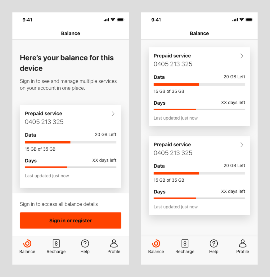
Our redesign aimed to shift the focus to customer outcomes: making it easier to check balances, recharge quickly, monitor data usage, and switch plans without confusion. We wanted to remove friction from the everyday actions users rely on most, especially for those with limited data, lower digital literacy, or accessibility needs.
By simplifying navigation, improving performance, and embedding accessibility from the ground up, the goal was to deliver a mobile-first experience that felt intuitive, inclusive, and built for people managing their services on the go—without the need for customer support.

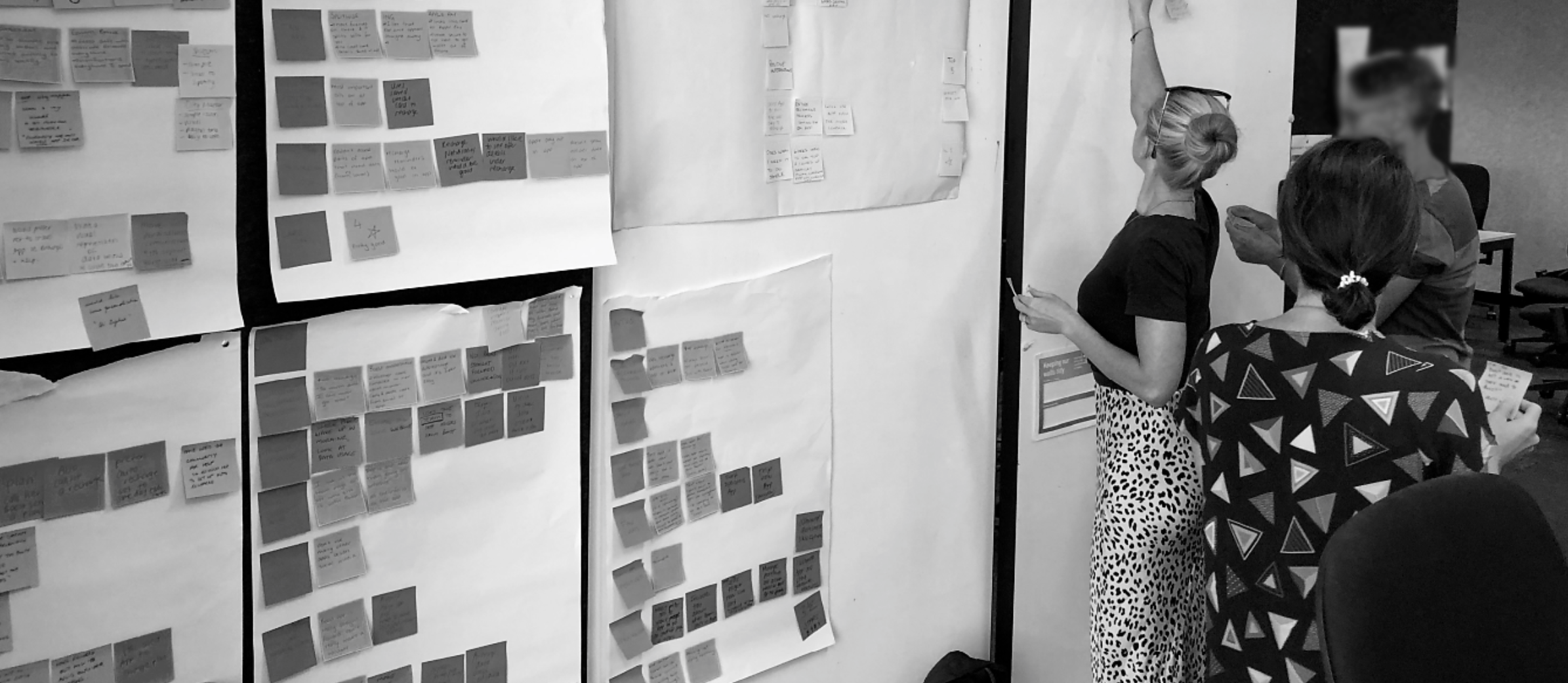
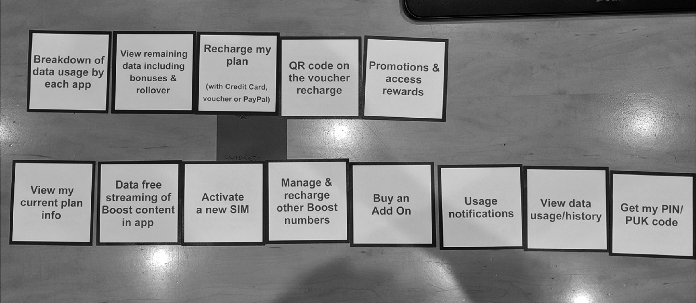
I kicked off with a problem framing session attended by stakeholders. Here, I discovered existing research on the old app, including contextual inquiries with customers and support staff. Part of the report included a wish list prioritisation exercise, which helped me to identify features to be considered for a minimum viable product (MVP). At this point, we ruled out promotions and loyalty, as we decided the team wouldn't be able to do these items justice within the initial time frame.
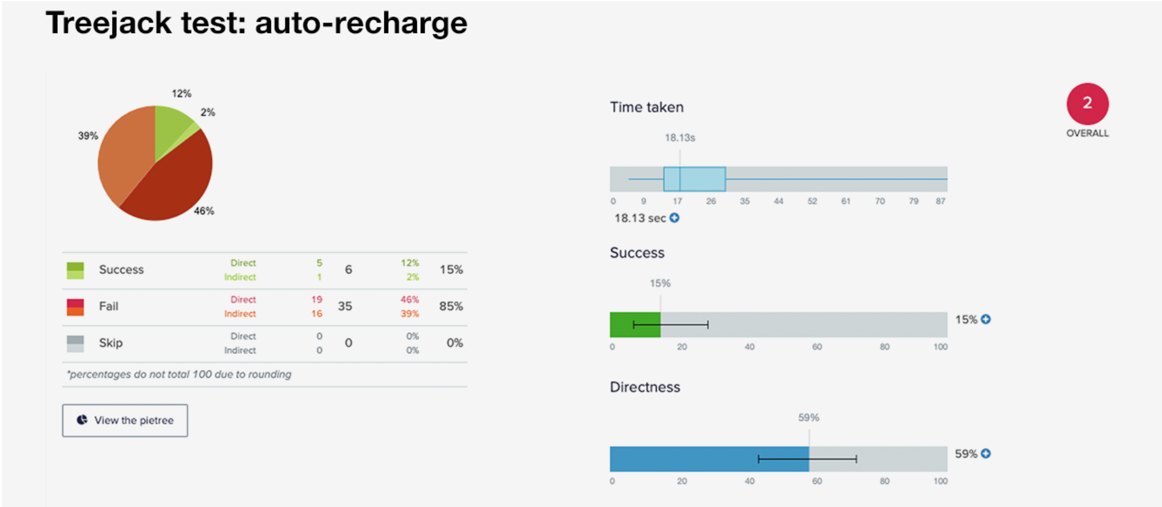
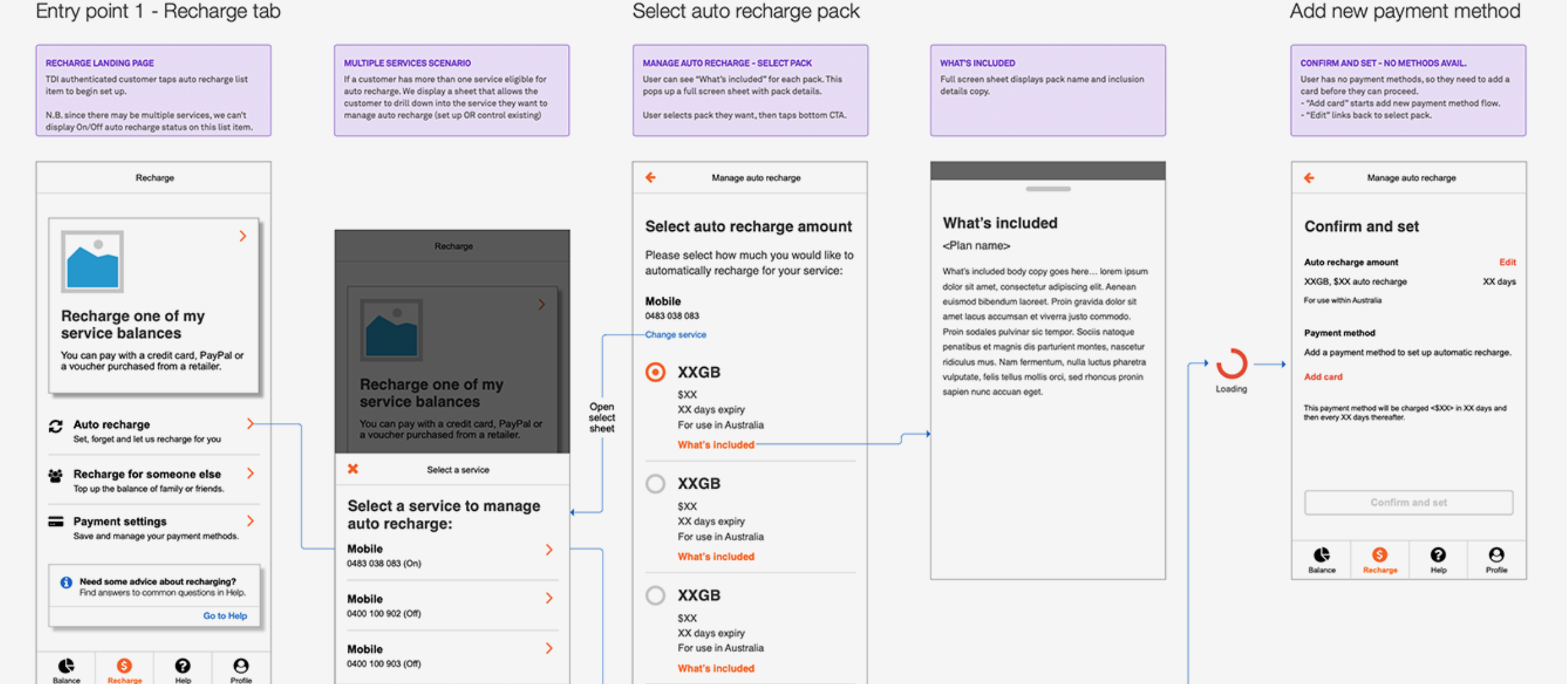
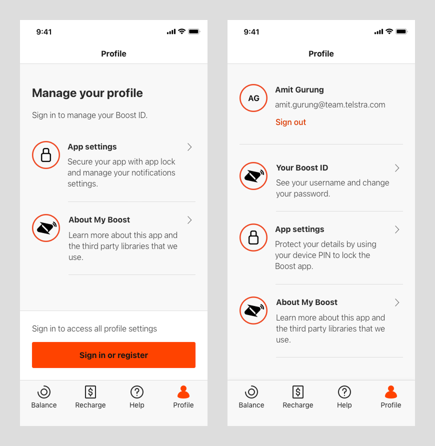
Redesigning the app’s information architecture (IA) was a challenge. The old app consisted of links to web flows. I wanted to change this to offer a true native experience. To validate the new IA, I worked with a research specialist to analyse a series of tree jack tests, which tasked participants to find various features. The results found there were some items that would work better in a different location. Users expected auto recharge and recharge history to be under the payments focused tab, rather than services where I initially put them. These findings were cross-checked with qualitative interviews.
To kick off the redesign of the Boost Mobile app, I began by establishing the foundation of a design system—leveraging Telstra’s enterprise-wide Able Design System as a base. While Able provided a comprehensive library of components, patterns, and visual tokens, adapting it to meet Boost’s unique needs wasn’t straightforward.
The original Sketch files were vast and complex—built for large-scale enterprise products. To make it workable, I had to carefully audit, extract, and streamline only the components relevant to Boost’s prepaid product experience. This involved filtering down thousands of layers to create a lighter, modular system suited for mobile-first delivery.
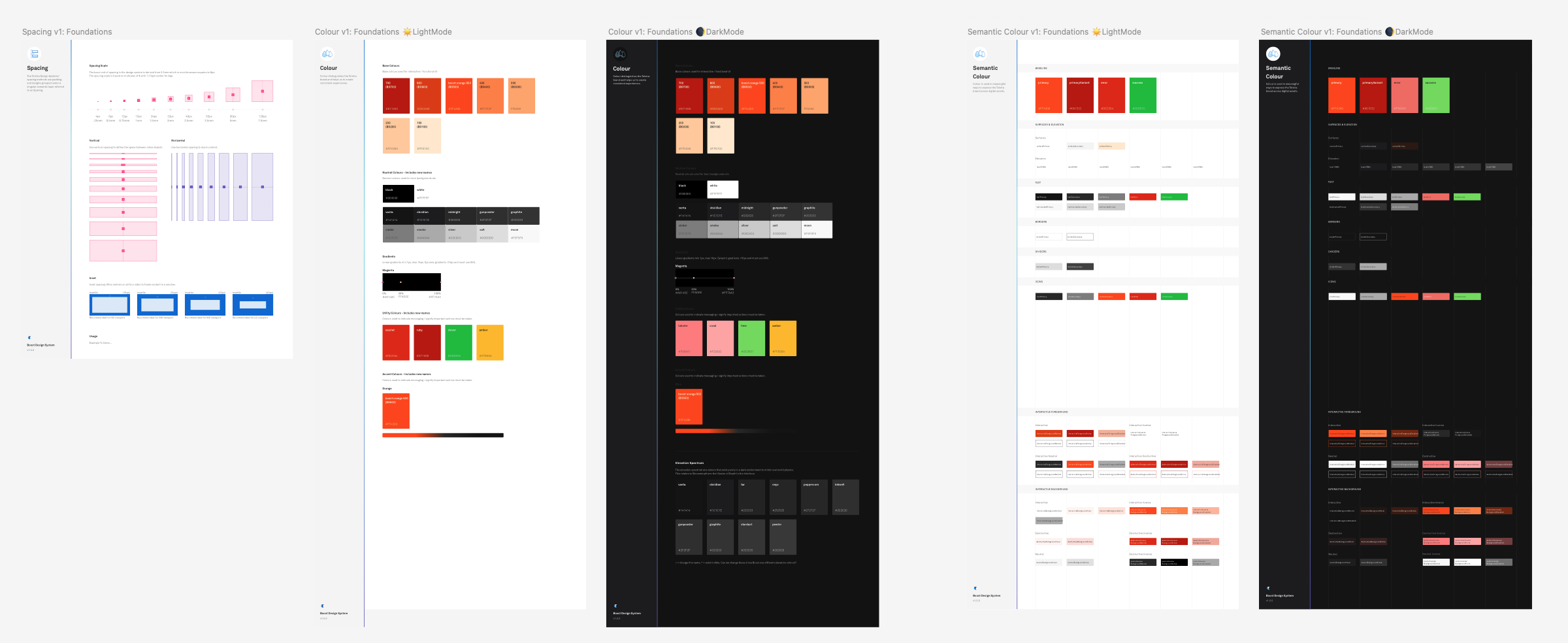
The goal was to maintain brand consistency while transforming the visual style into something more accessible, performant, and user-friendly. I refined the colour palette to ensure WCAG 2.1 AA compliance, adjusted type hierarchies and spacing for clarity and legibility, and defined a focused set of components—buttons, forms, cards, toggles—essential for prepaid workflows.
I also designed platform-specific patterns for iOS, Android, and web, ensuring the app delivered a truly native experience across all devices. This foundational work gave us the flexibility and control to build faster, test earlier, and scale smarter—without losing alignment with Telstra’s brand and accessibility standards.
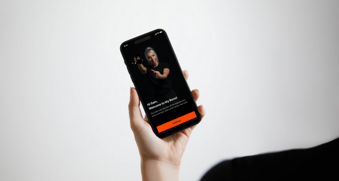
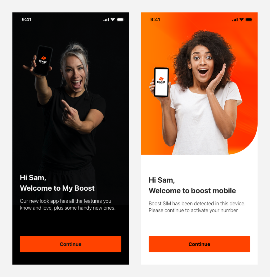
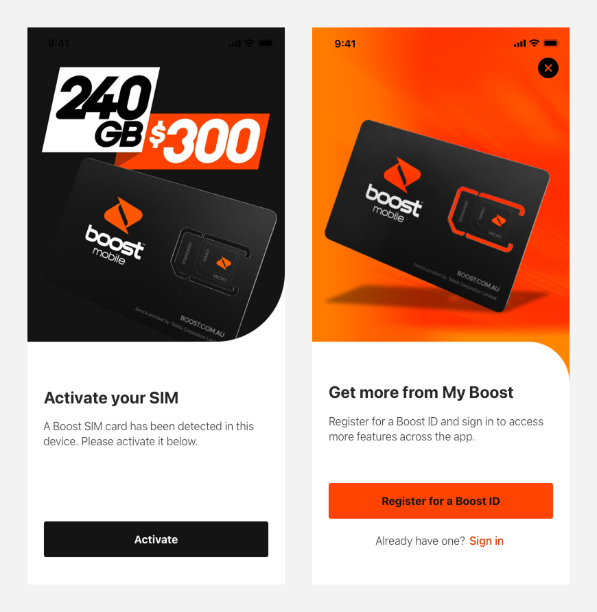
After testing, I finalised the wireframes for all critical flows, including interaction details, loading states, error handling and system feedback. I also completed accessibility documentation and voice-over scripting. These changes made a significant impact, as the old app had failed to meet essential usability criteria. I was proud to work with my team to bring the new app up to WCAG 2.1 AA standard. Here, I also contributed to go-to-market strategy, designing content and links to help users onboarding to the new app.
Efficient: The newly implemented information architecture introduced clear, purposeful navigation that aligns with how prepaid customers think and act. Key actions like recharging, checking balances, or updating details are now just a tap away—making self-service not only easier but faster.
Native: We rebuilt the app’s core flows using native iOS and Android interaction patterns, creating a fluid, responsive experience that feels intuitive and familiar. Users now benefit from platform-consistent design, smoother animations, and seamless transitions that match their device expectations.
Accessible: Accessibility was embedded from the start. The new design meets WCAG 2.1 AA standards with high contrast, scalable typography, larger touch targets, and voiceover support. This ensures that all users—including those with visual, motor, or cognitive impairments—can navigate and use the app independently and with confidence.
Post-implementation, our focus shifted to UX metrics to quantify the redesign's effectiveness. Usability dramatically improved, as evidenced by a higher mobile users, comments and feedbacks in app stores. Engagement metrics, such as completion rates, daily active users, showed an uptick, indicating that users found the redesigned app more compelling to use daily. Task success rates surged, particularly for critical actions such as bill payments or service upgrades, showcasing the app's enhanced efficiency.